
The TDP Logo: a modern pharmacy symbol for quality, delivered end-to-end
In regulated industries, a logo isn’t decoration, it’s a declaration. The TDP droplet was built to communicate, at a glance, what Total Delivery Pharma stands for: end-to-end delivery with authority, pace, and control.
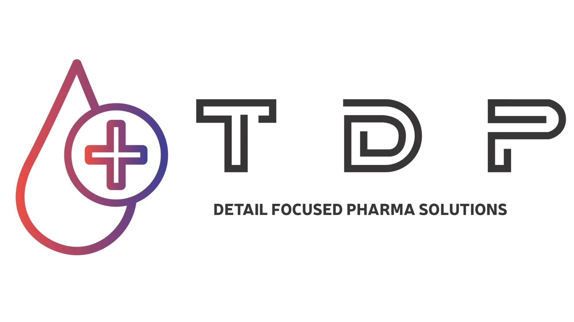
At first look, you’ll notice a clean, modern “+” embedded in the geometry, a quiet nod to the pharmacy cross, reinterpreted for today. It’s not a cliché; it’s a signal. This is a partner anchored in science and practice, not marketing gloss.
Then there’s the colour. A pinky-purple, off-red that recalls oxygenated arterial blood. The vital organ that almost all phramacuticals and life itself relies on. TDP’s work moves through a client’s operation in the same way: essential, directed, and sustaining the business. Quality is the circulation system; our mark makes that visible.
Across the droplet, a subtle phase/gradient conveys transition, the journey from finding to fixing, from audit to CAPA closure, from licence ambition to licence in hand. TDP works in those transitions. We move organisations forward, cleanly and measurably.
Colour that carries authority and performs in practice
Purple has long signalled authority, strength, and importance. Pairing it with arterial pink-red brings energy, urgency, and momentum. The “delivery” in Total Delivery Pharma.
The palette is intentionally practical. It must be legible on SOPs, compliant on slide decks, crisp on SharePoint tiles, and unmistakable on a conference banner. It also supports recognition when organisations search for GMP/GDP consulting, RP and RPi services, or WDA/MIA/MIA(IMP) licence support. A consistent visual identity helps build recall and trust before a first call or meeting.
A controlled droplet for governance, QMS, and regulated flow
Quality work isn’t linear, but it must be controlled, formative. The droplet’s smooth boundary suggests containment and governance, the discipline of a QMS where responsibilities are clear and flows are monitored.
Inside that shape, the implied “+” connects directly to modern pharmacy and positive action and multiple disiplines and specialities. It aligns with what clients expect from GMP/GDP audits, RP/RPi oversight, licence preparation, and supplier/3PL quality management: structured improvement, not just commentary.
Typography that stands up in inspected environments
The wordmark draws on the visual gravity you’ll recognise from established logotypes: precise, authoritative, and readable. That’s deliberate. In heavily audited environments, typography must communicate professionalism immediately.
TDP’s letterforms don’t claim affiliation; they mirror that recognised seriousness. It reflects how our systems, SOPs, and inspection preparation feel when you work with them – grounded, defensible, and ready to present to inspectors.
Why this matters for pharmaceutical quality and licensing
A logo in this context has a job to do. The TDP Droplet signals a partner that can diagnose and deliver:
Turning audit findings into closed, robust CAPAs
Shaping QMS frameworks that teams actually use
Giving clarity and practical oversight pathways
Moving WDA/MIA/MIA(IMP) programmes toward inspection-ready confidence
The phased droplet shows we understand transition. The arterial palette reflects the energy and momentum we bring to quality. The modern “+” anchors us in the pharmacy and life sciences world, today. And the authoritative wordmark signals that we are comfortable under scrutiny; on paper, on screen, and in front of regulators.
Our logo isn’t just an asset for slides and websites. It is a visual shorthand for how we work: end-to-end, with control. When you see the TDP droplet, you’re seeing what we aim to deliver on every engagement: clarity, continuity, and quality you can defend.
See how quality, delivered, can work for your organisation
If you’re reviewing your quality strategy, licensing roadmap, or RP capacity, we can help. Book a discovery call, bring your current position and constraints, and we’ll map out practical next steps for getting from intent to inspection-ready delivery.